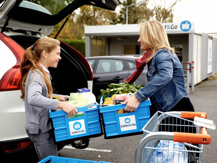
Collect & Go
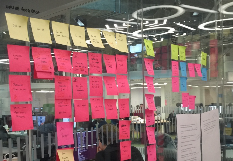
Ideation / Interaction Design
To facilitate Sainsbury’s vision of multichannel growth, they embarked on a project a move their groceries site to a more scalable platform, with the intention of migrating more digital properties once established. The project was one of the first and largest grocery implementations on IBM WebSphere Commerce anywhere in the world and included the migration of 8 million customer accounts, 4 million credit cards and 12 million orders.
Since this was primarily a re-platforming project with a strong remit to deliver a site that was as-is, the majority of work was ‘behind the scenes’. However, there were a number initiatives that were introduced as part of the project such as navigation improvements, the introduction of filtering and the ‘Checkout Walk’, all of which I was responsible for from an interaction design point of view.
Working on the Sainsburys groceries account was an interesting learning curve as it contradicted a number of things that are generally considered ‘Best Practice’ when it comes to eCommerce. These contradictions are brought on by the frequency of the shop (the regular weekly shop), the average basket size (which contains 60+ items instead of the usual 1 point something or other) and demands on back end systems.
The first misconception we had to deal with was that the Product Details Page (PDP) is key. Although the PDP is still relevant as it provides information about allergens and ingredients, it is not the main decision making page it is on other eCommerce sites. When it comes to groceries, the Product List Page (PLP) is the hub of the online experience – this is where the majority of time is spent.
The first was product findability; when there are over 20,000 SKU’s, finding a product is easy, however finding the right product can be difficult.
To address this, product attribution was introduced for the first time on the site. Although largely a data exercise, it allowed customers to filter large lists of products.
The concept of ‘Favourites First’ was also introduced which moves previously bought products to the top of the list enabling true personalisation of the result set as opposed to just segmentation.
The second was the presentation of product tiles as they needed to handle a variety of scenarios including promotions, catch weights, substitutions, cross-sells and a variety of stock situations so we made a point of designing for the worse case scenario.
The eCommerce ‘Best Practice’ of not interrupting Checkout also turned out to be bogus. Circa 90% of people who do their grocery shopping online will either miss an offer or forget to add something. Using a customers order history, Sainsburys was able to offer brief, helpful and personalised suggestions prior to the customer completing their order in the form of ‘Forgotten Favourites’ and ‘Offers you’ve missed’.
When these concepts initially underwent Usability Testing, the response was extremely negative – mainly because, with no record of participants’ past purchases, we had to use artificial data which gave the impression that this was going in for the hard sell. Yet despite this overwhelmingly negative reaction, the concept was spearheaded by a member of the leadership team and once launched, and using relevant data, the site saw hockey stick style increases in the average basket size as a direct result of gently offering helpful reminders during the checkout process.

All in all, due to the sheer size of the project, this was a challenging, yet rewarding, project to be involved in. Not only that, after go-live I was asked to act as the Interim UX Lead within Sainsbury’s to help recruit an internal team and progress a backlog of work that had been waiting for the new platform to be put in place.
Alternatively, if you’d prefer to discuss how I can help with your project, feel free to get in touch.