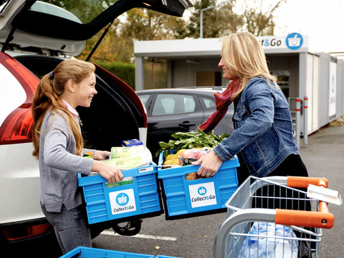
Collect & Go
Ideation / Interaction Design
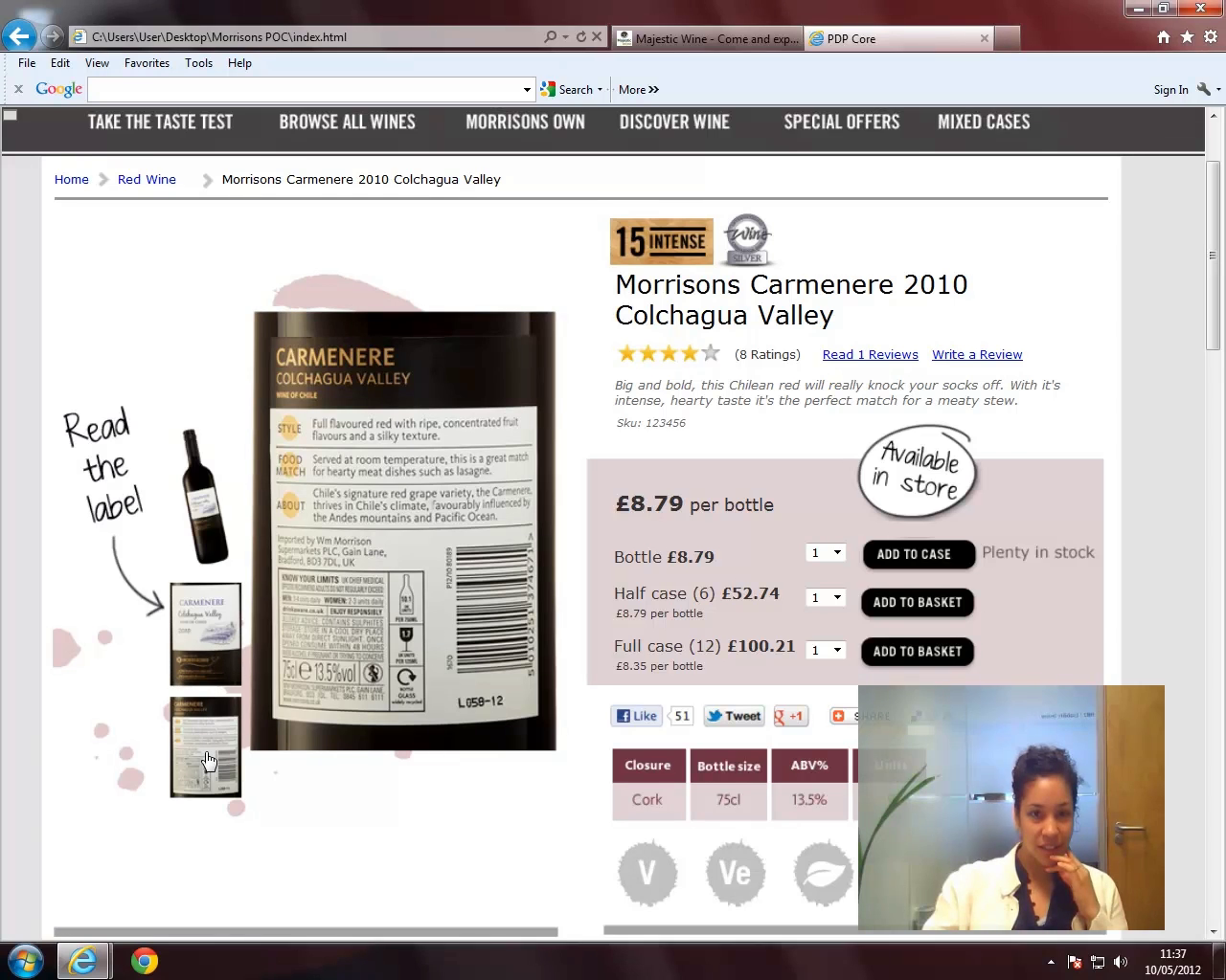
Morrisons Cellar, the specialist online wine retailer that won the PayPal eTail “Best Customer Experience“ award back in 2013, was Morrisons first foray into eCommerce.
What differentiated Morrisons Cellar from other online wine retailers was the sheer amount of quality, unique content they produced which helped position them as a true authority in the space. Another differentiator was the “Taste Test”; three simple questions which helped identify wines best suited your palette (this may sound gimmicky but it was remarkably accurate).

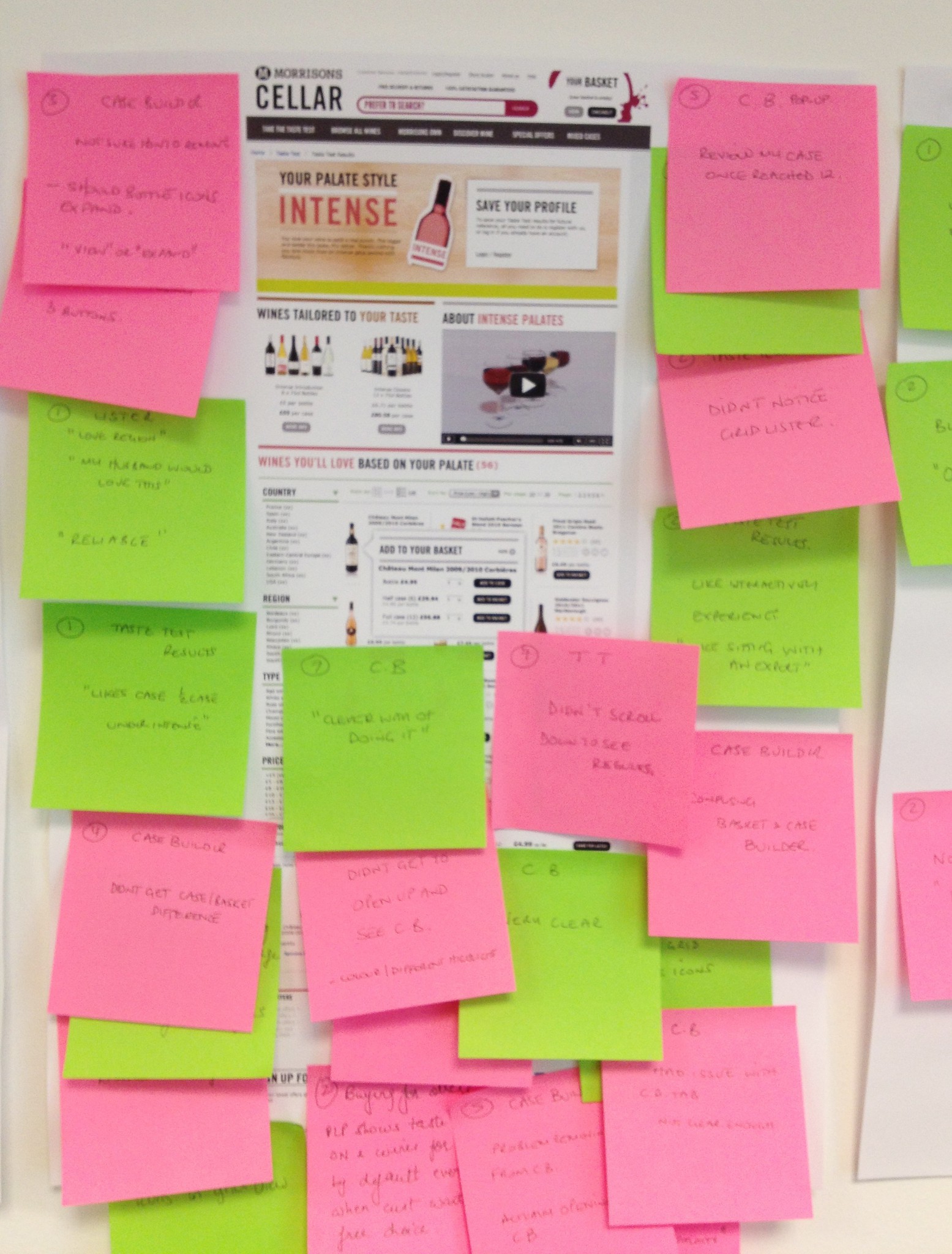
As well as creating the initial concepts, I was responsible for conducting multiple rounds of formative usability testing on the site using high-fidelity navigable wireframes to ensure the proposition was clear and that any barriers, whether they be copy or interactions, were minimised.


Each post-it note related to a specific observation where:
This acted as a good way of providing an on-the-day snapshot of where the main issues were without having to wait for any formal deliverables such as a report or edited highlights videos.
If you want to read more about my experience of working with supermarkets, you can read about my experience with Sainsbury’s which talks about specific considerations when designing for supermarkets.
Alternatively, if you’d prefer to discuss how I can help with your project, feel free to get in touch.